Report design includes several phases. Granted, these phases aren’t official: they’re more a reflection of my own thought processes and how my report designs typically unfold:
- the initial “get the data on the screen to see what we have” phase
- the addition of filters and prompts to assist with guided analysis
- the definition of interactions to support drill-down and detail level analysis
- and finally the beautification phase.
The most time-consuming phases of report design are the two middle phases. However, when demonstrating reports to business units, it is typically the last phase, the beautification phase, that gets business user buy-in.
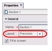 This last phase leads us to the topic of this post: object layering in SAS Visual Analytics Designer. You can layer report objects in all releases when using the precision layout option, but SAS Visual Analytics 6.3 introduced the ability to enable or disable Selection in viewer. This object property controls whether an object is selectable, i.e., whether you can select the object container or maximize the object in the viewers. The ability to layer and flatten text and graphs is a powerful tool when putting the polishing touches on your report design.
Here’s an overview of some of the report objects that can be layered:
Graph Objects
You can layer graph objects in all releases of SAS Visual Analytics Designer, but with the introduction of the Custom Graph Builder, you can create custom, reusable graph objects for all users, starting with twelve base graph elements. A custom graph can be:
- a single graph with specific customizations
- several graphs overlaid on each other
- a compilation of graphs.
If your custom graph contains several overlaid graphs, you can configure shared roles across x or y axes—a great new feature! Ultimately, once this custom graph is created, you will want to make it available for other users to leverage. Simply save your custom graph in a location that others can access.
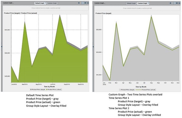
Here are just a couple of custom graph examples. Example 1 shows the default time series plot where the group style layout is overlay filled for both measures: Product Price (target) and Product Price (actual). I wanted my custom graph to have the target price use the overlay filled style and the actual price use the overlay unfilled (which is just a solid line) to better see how close the actual values are to the target values.
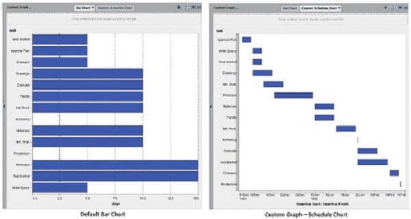
Example 2 shows a chart object not available in Designer: the Schedule Chart. You could have a bar chart displaying the total elapsed days for a project, but the custom schedule chart can actually graph the start and end for each task. The custom schedule chart also allows you to easily sort on the start/finish dates to get the proper order of your tasks.
Controls
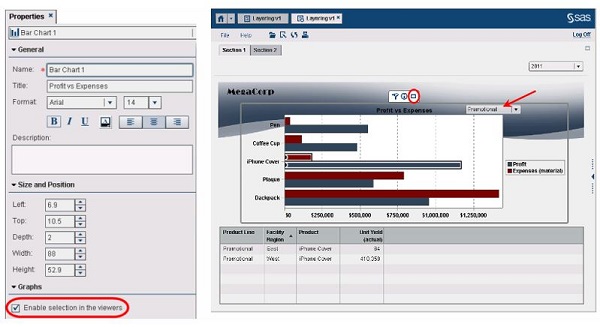
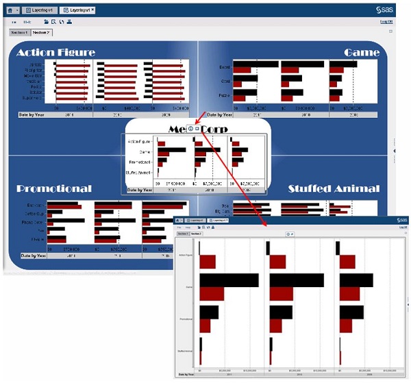
Layering objects gives the report designer the freedom to place report-body controls anywhere you wish. In this example, I placed the Product Line drop down control inside the frame of the bar chart.
If you have many graph objects on a dashboard-style report with drop-down menus that do not filter all of the graphs (which can happen when using several data sources that do not share columns), consider rearranging your objects so that the menus are closer to those affected objects. You can also use the text object to provide instructions for how to navigate the report.
Notice that the Enable selection in viewer option is true for the bar chart in this image. You can see the option to maximize the bar char is available. If not selected, then the window around the bar chart vanishes, but any interactions defined for the bar chart still exist.
Text and Image Objects
Layering text and image objects allows reports to be able to satisfy a wide range of report design requirements without distracting the report user. This next example uses several images and text objects but is seamless to the report user because the Enable selection in viewer option is false by default for text and image objects. Therefore, as the report user hovers over images and text to get to the graph, the only active window available for selection is the bar chart.
The next time you are heads down designing self-guiding reports, keep layering in the back of your mind for when you finally get the chance to breathe and put on those finishing touches!

5 Comments
Hi teri,
I am stuck with a problem using sas va .Please help me to create the below credit rating movement filter( credit_stage_movement field).I have a historical file like below which contains all fields except credit_stage_movement .My task is to create an indicator field like credit_stage_movement which shows whether crr moves from stage 1 to stage 2 by comparing crr_stage_identifier value of historical records.
Here X1 crr_stage_identifier value moves from 1 to 2 on the current period record from previous period.Hence credit_stage_movement contains 'stage 1 to stage 2'.
ifrs_id report_date ead ecl period_id crr_stage_identifier credit_stage_movement
X1 20161231 8 77 current period 2 stage 1 to stage 2
X2 20161231 6 55 current period 1 stage 3 to stage 1
X1 20161130 6 45 previous period 1
X2 20161130 4 34 previous period 3
Great post, Teri! We need more of such SAS Visual Analytics best practices. Could you provide any useful links on that? Thank you.
Thanks for sharing your experiences and thoughts. I'd be interested to know whether there are any other guidelines or formal documentation from your SAS Global Professional Services Enablement and Learning team.
Interesting thoughts on the report design process... Personally I feel that the beautification and report/design layout are worth considering early on in the process. Having a theme in place as a basis to build reports from and a design for the information flow could help reduce potential rework later down the track as Tricia Aanderud and I discuss some of these aspects in our SAS Visual Analytics dashboard SAS Global Forum 2014 paper, http://support.sas.com/resources/papers/proceedings14/1247-2014.pdf
I think the point you make about the importance of layering at report, control and object level are good to keep in mind. It reminds me of a post/discussion I had within the online SAS Visual Analytics community with building more stylish/infographic type reports https://communities.sas.com/docs/DOC-6852#comment-4226
Hi Michelle,
We don’t have anything branded from our team that is available but many of our guidelines make into the SAS Global Forum papers. You listed several great links, here is another one that can be helpful when determining the best way to visualize your data: http://support.sas.com/resources/papers/proceedings13/361-2013.pdf
Thank you for your feedback,
Teri
This was a very helpful article, thank you for posting it!